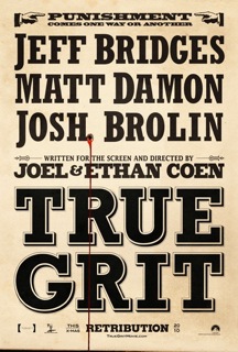
The Academy Awards are this Sunday and like a good Angeleno I will be watching. So out of the 10 films nominated for Best Picture, which should win the non-existant Oscar for Best Movie Poster? By my assessment, 4 out of the 10 are worthy of acknowledgment of some sort, so without further ado, here are my picks:
Best Reliance on Typography goes to... True Grit.
Although later posters incorporated photos of the main actors, I liked that the initial PR effort capitalized on the interesting combination of words that is "true" and "grit." Every time I saw one of these billboards, I'd wonder, what's the opposite of True Grit? False Clean?
Best Copywriting goes to... The Social Network
Catchy and provoking.
Best Uncommercial Poster Commission goes to... Black Swan
Designed by the British firm La Boca for Fox Searchlight, these graphic illustrated posters are a nice visual tie in to the Russian roots of the ballet Swan Lake. Plus they look great on a mousepad, as evidenced by the Fox studio store. For good measure, here is the mainstream poster for Black Swan, which I liked, too.
And finally, the Graphic Simplicity Award goes to... The King's Speech
Nice pop of color + Colin Firth's mouth, without which there would be no film + old fashioned radio microphone, which signals that this movie is not the one about a computer programmer. Very British, I think.


